Mobile usage is on the rise (as we’ve been saying for a while now). We’ve discovered that in 2017, 73 per cent of adults in the UK use the internet “on the go” (away from home or work) using a mobile or smartphone, laptop or other devices. We decided to conduct a short survey in our office. The stats showed over 90 per cent of us use the internet on our commute into work (except for Anthony, he drives...).
in 2017 to date, over 80 per cent of adults say that email is the thing they use most on the internet. The shift from desktop to mobile has continued to rise, with mobile email opens rising by 180 per cent in the last 3 years. As a small business, you can’t afford to ignore this data (hence bold). Use this data to your advantage and start optimising your emails for the small screens for 2018.
Email should be an important part of your marketing strategy. Especially with the rise of mobile and tablets being used to open your emails. Did you know that 69 per cent of customers will delete an email if it isn’t optimised for mobile!
We want to help your business do well, and as emails are an important clog in business marketing. We’ve narrowed it down to four areas to help you improve and optimise your email marketing this year.
Fewer images
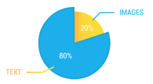
Your customers don’t want to wait for your images to load, or use their mobile data to download large files. Our top tips are to reduce the size of the image, and not include too many! The optimum ratio of text to image in an email is 80:20 - 80% text, 20% image.
The reason for this is, image heavy emails will end up in the recipient’s spam folders. If they do manage to pass the spam filter and find the inbox, you also run the risk of the images being blocked and not appearing, thus rendering them useless.
Increase the size of your CTA
Leave plenty of space around the button! The absolute minimum size for a call to action on mobile is 57x57 pixels (think of the size of the thumb that will press it). See below for the minimum size of a CTA:
You’ll read loads of articles about where to place your CTA, and each one will tell you something different. It’s up to you and the style of email you’re sending. If the email is short and sweet, having the CTA above the fold line in clear sight will be best. However, if it’s a storytelling email, the CTA should go at the bottom. And finally, and most importantly, make sure the CTA stands out in the email.
Subject line
Captivate your audience here with a juicy or catchy subject line. The average subject line is between 41-50 characters, but iPhone displays only the first 30 or so characters of a subject line when the device is held vertically, and the "from" label is actually displayed more prominently than the subject line.
Simplicity
Keep your design simple and the message clear, don’t be afraid of white space!
Overcrowded emails, especially around the CTA as previously mentioned, is a big no-no, but also try to avoid long paragraphs. Put the most important information at the top of the email, because readers today have short attention spans. Your readers will probably get distracted while reading your email, so by having this important information at the top, means they are more likely to read it.
Final Thoughts
With the year just beginning it’s a fantastic time to be looking at how to better your services. Email still plays a massive part in the day-to-day life of businesses, and we strongly encourage you, if you haven’t already, to use these tools to optimise your email campaign for 2018.
Share and enjoy
If you have any questions or comments about this post, please fill in the comment box below, or send me an email: shale@bonline.com. To find out more about bOnline, please visit our website.


